R for SQListas (2): Forecasting the Future

R for SQListas, part 2

Welcome to part 2 of my “R for SQListas” series. Last time, it was all about how to get started with R if you’re a SQL girl (or guy)- and that basically meant an introduction to Hadley Wickham’s dplyr and the tidyverse. The logic being: Don’t fear, it’s not that different from what you’re used to.
This (and upcoming) times it will be about the other side of the coin – if R was “basically just like SQL”, why not stick with SQL in the first place?
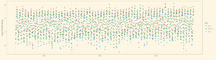
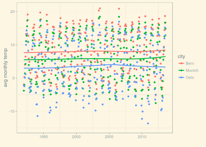
So now, it’s about things you cannot do with SQL, things R excels at – those things you’re learning R for :-). Remember in the last post, I said I was interested in future developments of weather/climate, and we explored the Kaggle Earth dataset (as well as another one, daily data measured at weather station Munich airport)? In this post, we’ll finally try to find out what’s going to happen to future winters. We’ll go beyond adding trend lines to measurements, and do some real time series analysis!

Inspecting the time series

First, we create a time series object from the dataframe and plot it – time series objects have their own plot() methods:

start_time <- as.Date("1992-01-01")
ts_1950 <- ts(df_munich$avg_temp, start = c(1950,1), end=c(2013,8), frequency = 12)

Plotting the time series with the default plotting method

Time series decomposition

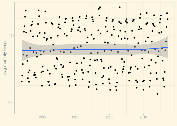
Now, let’s decompose the time series into its components: trend, seasonal effect, and remainder. We clearly expect there to be seasonality – the influence of the month we’re in should be clearly visible – but as stated before we’re mostly interested in the trend.


fit1 <- stlplus(ts_1950, s.window="periodic")
fit2 <- stlplus(ts_1992, s.window="periodic")
grid.arrange(plot(fit1), plot(fit2), ncol = 2)

The third row is the trend. Basically, there seems to be no trend – no long-term changes in the temperature level. However, by default, the trend displayed is rather „wiggly“.

Time series decomposition

We can experiment with different settings for the smoothing window of the trend. Let‘s use two different degrees of smoothing, both more „flattening“ than the default:


fit1 <- stlplus(ts_1950, s.window="periodic", t.window=37)
fit2 <- stlplus(ts_1950, s.window="periodic", t.window=51)
grid.arrange(plot(fit1), plot(fit2), ncol = 2, top = 'Time series decomposition, 1950 - 2013')

Time series decomposition, different degrees of smoothing

From these decompositions, it does not seem like there’s a significant trend. Let’s see if we can corroborate the visual impression by some statistical data. Let’s forecast the weather!
We will use two prominent approaches in time series modeling/forecasting: exponential smoothing and ARIMA.

Exponential smoothing

With exponential smoothing, the value at each point in time is basically seen as a weighted average, where more distant points weigh less and nearer points weigh more. In the simplest realization, a value at time t(n+1) is modeled as weighted average of the value at time t and the incoming observation at time t(n+1):


More complex models exist that factor in trends and seasonal effects.
For our case of a model with both trend and seasonal effects, the Holt-Winters exponential smoothing method generates point forecasts. Equivalently (conceptually that is, not implementation-wise; see http://robjhyndman.com/hyndsight/estimation2/), we can use the State Space Model (http://www.exponentialsmoothing.net/) that additionally generates prediction intervals.

The State Space Model is implemented in R by the ets() function in the forecast package. When we call ets() without any parameters, the method will determine a suitable model using maximum likelihood estimation. Let’s see the model chosen by ets():


fit <- ets(ts_1950)
summary(fit)

## ETS(A,N,A)
##
## Call:
## ets(y = ts_1950)
##
## Smoothing parameters:
## alpha = 0.0202
## gamma = 1e-04
##
## Initial states:
## l = 5.3364
## s=-8.3652 -4.6693 0.7114 5.4325 8.8662 9.3076
## 7.3288 4.1447 -0.677 -4.3463 -8.2749 -9.4586
##
## sigma: 1.7217
##
## AIC AICc BIC
## 5932.003 5932.644 6001.581
##
## Training set error measures:
## ME RMSE MAE MPE MAPE MASE
## Training set 0.02606379 1.72165 1.345745 22.85555 103.3956 0.7208272
## ACF1
## Training set 0.09684748

The model chosen does not contain a smoothing parameter for the trend (beta) – in fact, it is an A,N,A model, which is the acronym for Additive errors, No trend, Additive seasonal effects.
Let’s inspect the decomposition corresponding to this model – there is no trend line here:


plot(fit)

Time series decomposition using ets()

Now, let’s forecast the next 36 months!


plot(forecast(fit, h=36))

Forecast from ets()

The forecasts look rather „shrunken to the mean“, and the prediction intervals – dark grey indicates the 95%, light grey the 80% prediction interval – seem rather narrow. Indeed, narrow prediction intervals are often a problem with time series, because there are many sources of error that aren’t factored in the model (see http://robjhyndman.com/hyndsight/narrow-pi/).

ARIMA

The second approach to forecasting we will use is ARIMA. With ARIMA, there are three important concepts:

  1. AR(p): If a process is autoregressive, future values are obtained as linear combinations of past values, i.e.


    where e is white noise. A process that uses values from up to p time points back is called an AR(p) process.

  2. I(d):This refers to the number of times differencing (= subtraction of consecutive values) has to be applied to obtain a stationary series.
    If a time series yt is stationary, then for all s, the distribution of (y(t),…, y(t+s)) does not depend on t. Stationarity can be determined visually, inspecting the autocorrelation and partial autocorrelation functions, as well as using statistical tests.
  3. MA(q): An MA(q) process combines past forecast errors from time points up to p times back to forecast the current value:


While we can feed R’s Arima() function with our assumptions about the parameters (from data exploration or prior knowledge), there’s also auto.arima() which will determine the parameters for us.
Before calling auto.arima() though, let’s inspect the autocorrelation properties of our series. We clearly expect there to be autocorrelation – for one, adjacent months are similar in temperature, and second, we have similar temperatures every 12 months.


tsdisplay(ts_1950)

Autocorrelation check

So we clearly see that temperatures for adjacent months are positively correlated, while months in „opposite“ seasons are negatively correlated. The partial autocorrelations (where correlations at lower lags are controlled for) are quite strong, too. Does this mean the series is non-stationary?
Not really. A seasonal series of temperatures can be seen as a cyclostationary process (https://en.wikipedia.org/wiki/Cyclostationary_process) , where mean and variance are constant for seasonally corresponding measurements. We can check for stationarity using a statistical test, too:


adf.test(ts_1950)

##
## Augmented Dickey-Fuller Test
##
## data: ts_1950
## Dickey-Fuller = -11.121, Lag order = 9, p-value = 0.01
## alternative hypothesis: stationary

According to the Augmented Dickey-Fuller test, the null hypothesis onf non-stationarity should be rejected.
So now let’s run auto.arima on our time series.


fit <- auto.arima(ts_1950)
summary(fit)

## Series: ts_1950
## ARIMA(1,0,5)(0,0,2)[12] with non-zero mean
##
## Coefficients:
## ar1 ma1 ma2 ma3 ma4 ma5 sma1 sma2
## 0.6895 -0.0794 -0.0408 -0.1266 -0.3003 -0.2461 0.3972 0.3555
## s.e. 0.0409 0.0535 0.0346 0.0389 0.0370 0.0347 0.0413 0.0342
## intercept
## 5.1667
## s.e. 0.1137
##
## sigma^2 estimated as 7.242: log likelihood=-1838.47
## AIC=3696.94 AICc=3697.24 BIC=3743.33
##
## Training set error measures:
## ME RMSE MAE MPE MAPE MASE
## Training set -0.001132392 2.675279 2.121494 23.30576 116.9652 1.136345
## ACF1
## Training set 0.03740769

The model chosen by auto.arima is ARIMA(1,0,5)(0,0,2)[12] where the first triple of parameters refers to the non-seasonal part of ARIMA, the second to the seasonal one, and the subscript designates seasonality (12 in our case). So in both parts, no differences are applied (d=0). The non-seasonal part has an autoregressive and a moving average component, the seasonal one is moving average only.

Now, let’s get forecasting! Well, not so fast. ARIMA forecasts are based on the assumption that the residuals (errors) are uncorrelated and normally distributed. Let’s check this:


res <- fit$residuals
acf(res)

While normality of the errors is not a problem here, the ACF does not look good:

ACF of auto.arima() residuals

Clearly, the errors are not uncorrelated over time. We can improve auto.arima performance (at the cost of prolonged runtime) by allowing for a higher maximum number of parameters (max.order, which by default equals 5) and setting stepwise=FALSE:


fit <- auto.arima(ts_1950, max.order = 10, stepwise=FALSE)
summary(fit)

## Series: ts_1950
## ARIMA(5,0,1)(0,0,2)[12] with non-zero mean
##
## Coefficients:
## ar1 ar2 ar3 ar4 ar5 ma1 sma1 sma2
## 0.8397 -0.0588 -0.0691 -0.2087 -0.2071 -0.4538 0.0869 0.1422
## s.e. 0.0531 0.0516 0.0471 0.0462 0.0436 0.0437 0.0368 0.0371
## intercept
## 5.1709
## s.e. 0.0701
##
## sigma^2 estimated as 4.182: log likelihood=-1629.11
## AIC=3278.22 AICc=3278.51 BIC=3324.61
##
## Training set error measures:
## ME RMSE MAE MPE MAPE MASE
## Training set -0.003793625 2.033009 1.607367 -0.2079903 110.0913 0.8609609
## ACF1
## Training set -0.0228192

The less constrained model indeed performs better (judging by AIC, which drops from to 3696 to 3278). Autocorrelation of errors also is reduced overall.

Now, with the improved models, let’s finally get forecasting!


fit <- auto.arima(ts_1997, stepwise=FALSE, max.order = 10)
summary(fit)

Time series forecast from auto.arima()

Comparing this forecast with that from exponential smoothing, we see that exponential smoothing seems to deal better with smaller training samples, as well as with longer extrapolation periods.
Now we could go on and use still more sophisticated methods, or use hybrid models that combine different forecast methods, analogously to random forests, or even use deep learning – but I’ll leave that for another time 🙂 Thanks for reading!

Analyse de sentiments de critiques cinématographiques – version française

This is just an ultra short post saying that last Tuesday, I had the honor of presenting my “Sentiment Analysis of Movie Reviews” talk at Swiss Data Forum – in French 😉 Thanks again guys for having me, and for your patience 🙂

So here’s a link to the French version of the talk – toute la magie de word2vec et doc2vec, en français:-) Enjoy!

R for SQListas (1): Welcome to the Tidyverse

R for SQListas, what’s that about?

This is the 2-part blog version of a talk I’ve given at DOAG Conference this week. I’ve also uploaded the slides (no ppt; just pretty R presentation 😉 ) to the articles section, but if you’d like a little text I’m encouraging you to read on. That is, if you’re in the target group for this post/talk.
For this post, let me assume you’re a SQL girl (or guy). With SQL you’re comfortable (an expert, probably), you know how to get and manipulate your data, no nesting of subselects has you scared ;-). And now there’s this R language people are talking about, and it can do so many things they say, so you’d like to make use of it too – so now does this mean you have to start from scratch and learn – not only a new language, but a whole new paradigm? Turns out … ok. So that’s the context for this post.

Let’s talk about the weather

So in this post, I’d like to show you how nice R is to use if you come from SQL. But this isn’t going to be a syntax-only post. We’ll be looking at real datasets and trying to answer a real question.
Personally I’m very interested in how the weather’s going to develop in the future, especially in the nearer future, and especially regarding the area where I live (I know. It’s egocentric.). Specifically, what worries me are warm winters, and I’ll be clutching to any straw that tells me it’s not going to get warmer still 😉
So I’ve downloaded / prepared two datasets, both climate / weather-related. The first is the average global temperatures dataset from the Berkeley Earth Surface Temperature Study, nicely packaged by Kaggle (a website for data science competitions; https://www.kaggle.com/berkeleyearth/climate-change-earth-surface-temperature-data). This contains measurements from 1743 on, up till 2013. The monthly averages have been obtained using sophisticated scientific procedures available on the Berkeley Earth website (http://berkeleyearth.org/).
The second is daily weather data for Munich, obtained from http://www.wunderground.com. This dataset was retrieved manually, and the period was chosen so as to not contain too many missing values. The measurements range from 1997 to 2015, and have been aggregated by taking a monthly average.
Let’s start our journey through R land, reading in and looking at the beginning of the first dataset:

library(tidyverse)
library(lubridate)
df <- read_csv('data/GlobalLandTemperaturesByCity.csv')
head(df)
df <- read_csv('data/GlobalLandTemperaturesByCity.csv')
head(df)

## 1 1743-11-01 6.068 1.737 Århus
## 2 1743-12-01 NA NA Århus
## 3 1744-01-01 NA NA Århus
## 4 1744-02-01 NA NA Århus
## 5 1744-03-01 NA NA Århus
## 6 1744-04-01 5.788 3.624 Århus
## # ... with 3 more variables: Country , Latitude ,
## # Longitude

Now we’d like to explore the dataset. With SQL, this is easy: We use WHERE to filter rows, SELECT to select columns, GROUP BY to aggregate by one or more variables…And of course, we often need to JOIN tables, and sometimes, perform set operations. Then there’s all kinds of analytic functions, such as LAG() and LEAD(). How do we do all this in R?

Entering the tidyverse

Luckily for the SQLista, writing elegant, functional, and often rather SQL-like code in R is easy. All we need to do is … enter the tidyverse. Actually, we’ve already entered it – doing library(tidyverse) – and used it to read in our csv file (read_csv)!
The tidyverse is a set of packages, developed by Hadley Wickham, Chief Scientist at Rstudio, designed to make working with R easier and more consistent (and more fun). We load data from files using readr, clean up datasets that are not in third normal form using tidyr, manipulate data with dplyr, and plot them with ggplot2.
For our task of data exploration, it is dplyr we need. Before we even begin, let’s rename the columns so they have shorter names:

df <- rename(df, avg_temp = AverageTemperature, avg_temp_95p = AverageTemperatureUncertainty, city = City, country = Country, lat = Latitude, long = Longitude)
head(df)

## # A tibble: 6 × 7
## dt avg_temp avg_temp_95p city country lat long
##
## 1 1743-11-01 6.068 1.737 Århus Denmark 57.05N 10.33E
## 2 1743-12-01 NA NA Århus Denmark 57.05N 10.33E
## 3 1744-01-01 NA NA Århus Denmark 57.05N 10.33E
## 4 1744-02-01 NA NA Århus Denmark 57.05N 10.33E
## 5 1744-03-01 NA NA Århus Denmark 57.05N 10.33E
## 6 1744-04-01 5.788 3.624 Århus Denmark 57.05N 10.33E

distinct() (SELECT DISTINCT)

Good. Now that we have this new dataset containing temperature measurements, really the first thing we want to know is: What locations (countries, cities) do we have measurements for?
To find out, just do distinct():

distinct(df, country)

## # A tibble: 159 × 1
## country
##
## 1 Denmark
## 2 Turkey
## 3 Kazakhstan
## 4 China
## 5 Spain
## 6 Germany
## 7 Nigeria
## 8 Iran
## 9 Russia
## 10 Canada
## # ... with 149 more rows

distinct(df, city)

## # A tibble: 3,448 × 1
## city
##
## 1 Århus
## 2 Çorlu
## 3 Çorum
## 4 Öskemen
## 5 Ürümqi
## 6 A Coruña
## 7 Aachen
## 8 Aalborg
## 9 Aba
## 10 Abadan
## # ... with 3,438 more rows

filter() (WHERE)

OK. Now as I said I’m really first and foremost curious about measurements from Munich, so I’ll have to restrict the rows. In SQL I’d need a WHERE clause, in R the equivalent is filter():

filter(df, city == 'Munich')
## # A tibble: 3,239 × 7
## dt avg_temp avg_temp_95p city country lat long
##
## 1 1743-11-01 1.323 1.783 Munich Germany 47.42N 10.66E
## 2 1743-12-01 NA NA Munich Germany 47.42N 10.66E
## 3 1744-01-01 NA NA Munich Germany 47.42N 10.66E
## 4 1744-02-01 NA NA Munich Germany 47.42N 10.66E
## 5 1744-03-01 NA NA Munich Germany 47.42N 10.66E
## 6 1744-04-01 5.498 2.267 Munich Germany 47.42N 10.66E
## 7 1744-05-01 7.918 1.603 Munich Germany 47.42N 10.66E

This is how we combine conditions if we have more than one of them in a where clause:

# AND
filter(df, city == 'Munich', year(dt) > 2000)
## # A tibble: 153 × 7
## dt avg_temp avg_temp_95p city country lat long
##
## 1 2001-01-01 -3.162 0.396 Munich Germany 47.42N 10.66E
## 2 2001-02-01 -1.221 0.755 Munich Germany 47.42N 10.66E
## 3 2001-03-01 3.165 0.512 Munich Germany 47.42N 10.66E
## 4 2001-04-01 3.132 0.329 Munich Germany 47.42N 10.66E
## 5 2001-05-01 11.961 0.150 Munich Germany 47.42N 10.66E
## 6 2001-06-01 11.468 0.377 Munich Germany 47.42N 10.66E
## 7 2001-07-01 15.037 0.316 Munich Germany 47.42N 10.66E
## 8 2001-08-01 15.761 0.325 Munich Germany 47.42N 10.66E
## 9 2001-09-01 7.897 0.420 Munich Germany 47.42N 10.66E
## 10 2001-10-01 9.361 0.252 Munich Germany 47.42N 10.66E
## # ... with 143 more rows

# OR
filter(df, city == 'Munich' | year(dt) > 2000)

## # A tibble: 540,116 × 7
## dt avg_temp avg_temp_95p city country lat long
##
## 1 2001-01-01 1.918 0.381 Århus Denmark 57.05N 10.33E
## 2 2001-02-01 0.241 0.328 Århus Denmark 57.05N 10.33E
## 3 2001-03-01 1.310 0.236 Århus Denmark 57.05N 10.33E
## 4 2001-04-01 5.890 0.158 Århus Denmark 57.05N 10.33E
## 5 2001-05-01 12.016 0.351 Århus Denmark 57.05N 10.33E
## 6 2001-06-01 13.944 0.352 Århus Denmark 57.05N 10.33E
## 7 2001-07-01 18.453 0.367 Århus Denmark 57.05N 10.33E
## 8 2001-08-01 17.396 0.287 Århus Denmark 57.05N 10.33E
## 9 2001-09-01 13.206 0.207 Århus Denmark 57.05N 10.33E
## 10 2001-10-01 11.732 0.200 Århus Denmark 57.05N 10.33E
## # ... with 540,106 more rows

select() (SELECT)

Now, often we don’t want to see all the columns/variables. In SQL we SELECT what we’re interested in, and it’s select() in R, too:
select(filter(df, city == 'Munich'), avg_temp, avg_temp_95p)

## # A tibble: 3,239 × 2
## avg_temp avg_temp_95p
##
## 1 1.323 1.783
## 2 NA NA
## 3 NA NA
## 4 NA NA
## 5 NA NA
## 6 5.498 2.267
## 7 7.918 1.603
## 8 11.070 1.584
## 9 12.935 1.653
## 10 NA NA
## # ... with 3,229 more rows

arrange() (ORDER BY)

How about ordered output? This can be done using arrange():

arrange(select(filter(df, city == 'Munich'), dt, avg_temp), avg_temp)

## # A tibble: 3,239 × 2
## dt avg_temp
##
## 1 1956-02-01 -12.008
## 2 1830-01-01 -11.510
## 3 1767-01-01 -11.384
## 4 1929-02-01 -11.168
## 5 1795-01-01 -11.019
## 6 1942-01-01 -10.785
## 7 1940-01-01 -10.643
## 8 1895-02-01 -10.551
## 9 1755-01-01 -10.458
## 10 1893-01-01 -10.381
## # ... with 3,229 more rows

Do you think this is starting to get difficult to read? What if we add FILTER and GROUP BY operations to this query? Fortunately, with dplyr it is possible to avoid paren hell as well as stepwise assignment using the pipe operator, %>%.

Meet: %>% – the pipe

The pipe transforms an expression of form x %>% f(y) into f(x, y) and so, allows us write the above operation like this:

df %>% filter(city == 'Munich') %>% select(dt, avg_temp) %>% arrange(avg_temp)

This looks a lot like the fluent API design popular in some object oriented languages, or the bind operator, >>=, in Haskell.
It also looks a lot more like SQL. However, keep in mind that while SQL is declarative, the order of operations matters when you use the pipe (as the name says, the output of one operation is piped to another). You cannot, for example, write this (trying to emulate SQL‘s SELECT – WHERE – ORDER BY ): df %>% select(dt, avg_temp) %>% filter(city == ‘Munich’) %>% arrange(avg_temp). This can’t work because after a new dataframe has been returned from the select, the column city is not longer available.

arrange() (GROUP BY)

Now that we’ve introduced the pipe, on to group by. This is achieved in dplyr using group_by() (for grouping, obviously) and summarise() for aggregation.
Let’s find the countries we have most – and least, respectively – records for:

# most records
df %>% group_by(country) %>% summarise(count=n()) %>% arrange(count %>% desc())

## # A tibble: 159 × 2
## country count
##
## 1 India 1014906
## 2 China 827802
## 3 United States 687289
## 4 Brazil 475580
## 5 Russia 461234
## 6 Japan 358669
## 7 Indonesia 323255
## 8 Germany 262359
## 9 United Kingdom 220252
## 10 Mexico 209560
## # ... with 149 more rows

# least records
df %>% group_by(country) %>% summarise(count=n()) %>% arrange(count)

## # A tibble: 159 × 2
## country count
##
## 1 Papua New Guinea 1581
## 2 Oman 1653
## 3 Djibouti 1797
## 4 Eritrea 1797
## 5 Botswana 1881
## 6 Lesotho 1881
## 7 Namibia 1881
## 8 Swaziland 1881
## 9 Central African Republic 1893
## 10 Congo 1893

How about finding the average, minimum and maximum temperatures per month, looking at just records from Germany, and that originate after 1949?

df %>% filter(country == 'Germany', !is.na(avg_temp), year(dt) > 1949) %>% group_by(month(dt)) %>% summarise(count = n(), avg = mean(avg_temp), min = min(avg_temp), max = max(avg_temp))

## # A tibble: 12 × 5
## `month(dt)` count avg min max
##
## 1 1 5184 0.3329331 -10.256 6.070
## 2 2 5184 1.1155843 -12.008 7.233
## 3 3 5184 4.5513194 -3.846 8.718
## 4 4 5184 8.2728137 1.122 13.754
## 5 5 5184 12.9169965 5.601 16.602
## 6 6 5184 15.9862500 9.824 21.631
## 7 7 5184 17.8328285 11.697 23.795
## 8 8 5184 17.4978752 11.390 23.111
## 9 9 5103 14.0571383 7.233 18.444
## 10 10 5103 9.4110645 0.759 13.857
## 11 11 5103 4.6673114 -2.601 9.127
## 12 12 5103 1.3649677 -8.483 6.217

In this way, aggregation queries can be written that are powerful and very readable at the same time. So at this point, we know how to do basic selects with filtering and grouping. How about joins?

JOINs

Dplyr provides inner_join(), left_join(), right_join() and full_join() operations, as well as semi_join() and anti_join(). From the SQL viewpoint, these work exactly as expected.
To demonstrate a join, we’ll now load the second dataset, containing daily weather data for Munich, and aggregate it by month:

daily_1997_2015 % summarise(mean_temp = mean(mean_temp))
monthly_1997_2015

## # A tibble: 228 × 2
## month mean_temp
##
## 1 1997-01-01 -3.580645
## 2 1997-02-01 3.392857
## 3 1997-03-01 6.064516
## 4 1997-04-01 6.033333
## 5 1997-05-01 13.064516
## 6 1997-06-01 15.766667
## 7 1997-07-01 16.935484
## 8 1997-08-01 18.290323
## 9 1997-09-01 13.533333
## 10 1997-10-01 7.516129
## # ... with 218 more rows

Fine. Now let’s join the two datasets on the date column (their respective keys), telling R that this column is named dt in one dataframe, month in the other:

df % select(dt, avg_temp) %>% filter(year(dt) > 1949)
df %>% inner_join(monthly_1997_2015, by = c("dt" = "month"), suffix )

## # A tibble: 705,510 × 3
## dt avg_temp mean_temp
##
## 1 1997-01-01 -0.742 -3.580645
## 2 1997-02-01 2.771 3.392857
## 3 1997-03-01 4.089 6.064516
## 4 1997-04-01 5.984 6.033333
## 5 1997-05-01 10.408 13.064516
## 6 1997-06-01 16.208 15.766667
## 7 1997-07-01 18.919 16.935484
## 8 1997-08-01 20.883 18.290323 of perceptrons
## 9 1997-09-01 13.920 13.533333
## 10 1997-10-01 7.711 7.516129
## # ... with 705,500 more rows

As we see, average temperatures obtained for the same month differ a lot from each other. Evidently, the methods of averaging used (by us and by Berkeley Earth) were very different. We will have to use every dataset separately for exploration and inference.

Set operations

Having looked at joins, on to set operations. The set operations known from SQL can be performed using dplyr’s intersect(), union(), and setdiff() methods. For example, let’s combine the Munich weather data from before 2016 and from 2016 in one data frame:

daily_2016 % arrange(day)

## # A tibble: 7,195 × 23
## day max_temp mean_temp min_temp dew mean_dew min_dew max_hum
##
## 1 1997-01-01 -8 -12 -16 -13 -14 -17 92
## 2 1997-01-02 0 -8 -16 -9 -13 -18 92
## 3 1997-01-03 -4 -6 -7 -6 -8 -9 93
## 4 1997-01-04 -3 -4 -5 -5 -6 -6 93
## 5 1997-01-05 -1 -3 -6 -4 -5 -7 100
## 6 1997-01-06 -2 -3 -4 -4 -5 -6 93
## 7 1997-01-07 0 -4 -9 -6 -9 -10 93
## 8 1997-01-08 0 -3 -7 -7 -7 -8 100
## 9 1997-01-09 0 -3 -6 -5 -6 -7 100
## 10 1997-01-10 -3 -4 -5 -4 -5 -6 100
## # ... with 7,185 more rows, and 15 more variables: mean_hum ,
## # min_hum , max_hpa , mean_hpa , min_hpa ,
## # max_visib , mean_visib , min_visib , max_wind ,
## # mean_wind , max_gust , prep , cloud ,
## # events , winddir

Window (AKA analytic) functions

Joins, set operations, that’s pretty cool to have but that’s not all. Additionally, a large number of analytic functions are available in dplyr. We have the familiar-from-SQL ranking functions (e.g., dense_rank(), row_number(), ntile(), and cume_dist()):

# 5% hottest days
filter(daily_2016, cume_dist(desc(mean_temp)) % select(day, mean_temp)

## # A tibble: 5 × 2
## day mean_temp
##
## 1 2016-06-24 22
## 2 2016-06-25 22
## 3 2016-07-09 22
## 4 2016-07-11 24
## 5 2016-07-30 22

# 3 coldest days
filter(daily_2016, dense_rank(mean_temp) % select(day, mean_temp) %>% arrange(mean_temp)

## # A tibble: 4 × 2
## day mean_temp
##
## 1 2016-01-22 -10
## 2 2016-01-19 -8
## 3 2016-01-18 -7
## 4 2016-01-20 -7

We have lead() and lag():

# consecutive days where mean temperature changed by more than 5 degrees:
daily_2016 %>% mutate(yesterday_temp = lag(mean_temp)) %>% filter(abs(yesterday_temp - mean_temp) > 5) %>% select(day, mean_temp, yesterday_temp)

## # A tibble: 6 × 3
## day mean_temp yesterday_temp
##
## 1 2016-02-01 10 4
## 2 2016-02-21 11 3
## 3 2016-06-26 16 22
## 4 2016-07-12 18 24
## 5 2016-08-05 14 21
## 6 2016-08-13 19 13

We also have lots of aggregation functions that, if already provided in base R, come with enhancements in dplyr. Such as, choosing the column that dictates accumulation order. New in dplyr is e.g., cummean(), the cumulative mean:

daily_2016 %>% mutate(cum_mean_temp = cummean(mean_temp)) %>% select(day, mean_temp, cum_mean_temp)

## # A tibble: 260 × 3
## day mean_temp cum_mean_temp
##
## 1 2016-01-01 2 2.0000000
## 2 2016-01-02 -1 0.5000000
## 3 2016-01-03 -2 -0.3333333
## 4 2016-01-04 0 -0.2500000
## 5 2016-01-05 2 0.2000000
## 6 2016-01-06 2 0.5000000
## 7 2016-01-07 3 0.8571429
## 8 2016-01-08 4 1.2500000
## 9 2016-01-09 4 1.5555556
## 10 2016-01-10 3 1.7000000
## # ... with 250 more rows

OK. Wrapping up so far, dplyr should make it easy to do data manipulation if you’re used to SQL. So why not just use SQL, what can we do in R that we couldn’t do before?

Visualization

Well, one thing R excels at is visualization. First and foremost, there is ggplot2, Hadley Wickham‘s famous plotting package, the realization of a “grammar of graphics”. ggplot2 predates the tidyverse, but became part of it once it came to life. We can use ggplot2 to plot the average monthly temperatures from Berkeley Earth for selected cities and time ranges, like this:

cities = c("Munich", "Bern", "Oslo")
df_cities % filter(city %in% cities, year(dt) > 1949, !is.na(avg_temp))
(p_1950 <- ggplot(df_cities, aes(dt, avg_temp, color = city)) + geom_point() + xlab("") + ylab("avg monthly temp") + theme_solarized())

Average monthly temperatures for three selected cities

While this plot is two-dimensional (with axes time and temperature), a third “dimension” is added via the color aesthetic (aes (…, color = city)).

We can easily reuse the same plot, zooming in on a shorter time frame:

start_time <- as.Date("1992-01-01")
end_time <- as.Date("2013-08-01")
limits <- c(start_time,end_time)
(p_1992 <- p_1950 + (scale_x_date(limits=limits)))

The same plot, but zooming in on a shorter time period

It seems like overall, Bern is warmest, Oslo is coldest, and Munich is in the middle somewhere.
We can add smoothing lines to see this more clearly (by default, confidence intervals would also be displayed, but I’m suppressing them here so as to show the three lines more clearly):

(p_1992 <- p_1992 + geom_smooth(se = FALSE))

Adding smoothing lines to more clearly see the trend

Good. Now that we have these lines, can we rely on them to obtain a trend for the temperature? Because that is, ultimately, what we want to find out about.
From here on, we’re zooming in on Munich. Let’s display that trend line for Munich again, this time with the 95% confidence interval added:

p_munich_1992 <- p_munich_1950 + (scale_x_date(limits=limits))
p_munich_1992 + stat_smooth()

Smoothing line with confidence interval added

Calling stat_smooth() without specifying a smoothing method uses Local Polynomial Regression Fitting (LOESS). However, we could as well use another smoothing method, for example, we could fit a line using lm(). Let’s compare them both:

loess <- p_munich_1992 + stat_smooth(method = "loess", colour = "red") + labs(title = 'loess')
lm <- p_munich_1992 + stat_smooth(method = "lm", color = "green") + labs(title = 'lm')
grid.arrange(loess, lm, ncol=2) (p_1992 <- p_1950 + (scale_x_date(limits=limits)))

Comparing two different smoothing methods (LOESS vs. LM)

Both fits behave quite differently, especially as regards the shape of the confidence interval near the end (and beginning) of the time range. If we want to form an opinion regarding a possible trend, we will have to do more than just look at the graphs – time to do some time series analysis!
Given this post has become quite long already, we’ll continue in the next – so how about next winter? Stay tuned 🙂